Understanding Scale in Digital Mockups
If you haven’t guessed yet, I am a big fan of using digital mockups. I love how relatively easy they are (at least for me) compared to product photography. I seek to make mockups that mirror reality as closely as I can. In my post on shadow, I explained how our brains interpret images. The gist is this: our brains like things to look as realistic as possible. Another way to make digital mockups look more realistic is to be tuned into the scale and size of objects in digital mockups. Let’s explore understanding scale in digital mockups to create eye-catching images.
What is Scale?
Scale, in its simplest form, is how one object compares in size to another. Our brains are naturally wired to perceive scale and use it to make sense of the world around us. It is how we judge the size and distance of objects around us.
By using scale in different ways in our designs, we can create visual interest and emphasis. This draws the viewer’s attention to specific elements and creates a sense of depth and dimensionality in our designs. using size and scale with images and text, we can somewhat control what our viewers see – and in what order they see it.
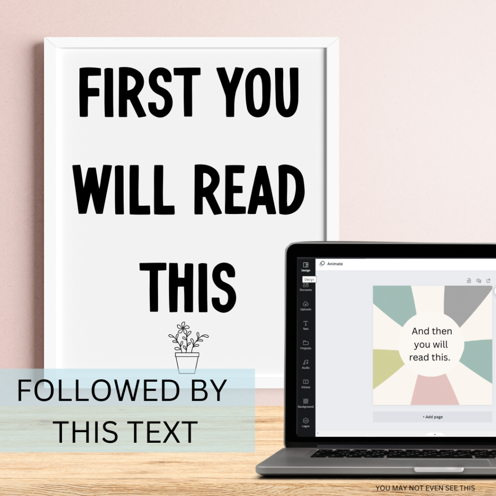
Was I right? 🙂
Realistic Scale
Using scale correctly in mockups is important for many reasons. Correct scale gives potential buyers an instant, accurate representation of the product. An accurate to reality display of your product can help teachers better visualize if your product is going to fit their needs. These decisions are often made in seconds by teachers! Additionally, using a realistic scale can help build trust with buyers, as it shows that the seller is transparent and honest about the product they are selling. By providing clear and accurate representations of your products, you – as a teacher seller – can enhance your credibility and increase customer satisfaction. This often leads to repeat buyers and reviews.
For Example…
Sometimes, when scale is not used correctly, we draw attention to the wrong things in our designs. The most common issue I see with scale is when movable piece images are inserted at an unrealistic size. Hands are a great example! I have frequently seen hands inserted into digital mockups that are FAR to small for the scale of the mockup. (See image below.) Instead of seeing the task cards, your brain focuses on this small hand! Your brain is too busy trying to make sense of the small hand instead of focusing on the product.
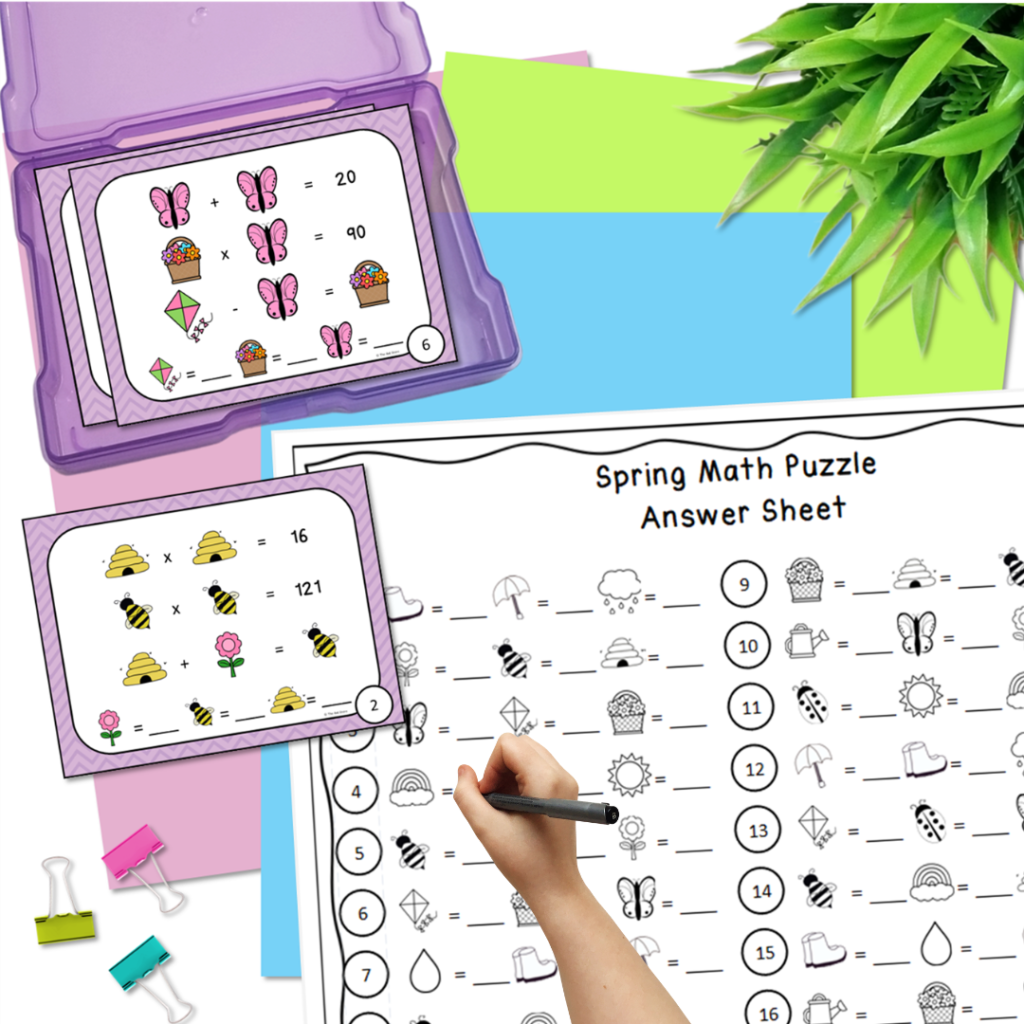
When I construct a digital mockup, I try to make sure my proportions are “close enough” to mimic reality. I don’t have the patience to measure out and do all of the math. (Kuddos to you if you do!!) My task cards were sized by playing them over the answer sheet, knowing they are slightly smaller than a quarter of the page. Then, I was able to size the task card box and clips.
When learning how to scale adding hands into my mockups, I would literally take out a piece of paper, pencil, and my phone camera and take a picture of my hand. I would then try to match it to my mockup.

(I understand that this skill is easier for some than others. Scale comes naturally to my brain. I actually did the mockup image before comparing to my actual hand. Pretty proud of how close it was!)

Larger the Life Scale
There are times you may use larger proportions than reality in digital mockups. Larger than life examples can be used if you want to emphasize or highlight certain features or details of the given product. For example, if you are creating a mockup of a classroom poster, you may use a larger scale to emphasize the text or images on the poster, making it easier for potential buyers to read and understand the content. Additionally, using a larger scale may also help your product stand out and catch the attention of potential buyers when displayed alongside other products in an online marketplace or store. However, it’s important to ensure your mockup still provides an accurate representation of the product. Any size discrepancies should be clearly communicated in the product description to avoid misrepresentation or confusion.
For this product line, I wanted to both emphasize the size of the cards and the look of each card. I purposely chose to enlarge one of the cards on my product cover.

Final Thoughts
I am just your average teacher seller trying to help other teacher sellers. Are all of my mockups perfect? Absolutely not! But as I learn more, I want to share more! Paying attention to how you are using scale in digital mockups is one way to keep them looking realistic and presentable. Keep learning. Keep creating!
You may also enjoy…