The Power of Shadows in Digital Mockups
Our brains are interesting – fascinating – things. It is often said “Your brain doesn’t know the difference between reality and the imaginary.” While the statement is not entirely true, it’s close enough for today’s explanation about the use of shadows in digital (typically flat lay) mockups.
Our brains are smarter than we can even comprehend. Each second, almost 11 billion bits of information travel to and from the brain! And with that processing capability, the brain processes images 60,000 times faster than text! The images we use to display our products matter!

So, how does this brain talk relate to a mockup?
Well, with so much information available to us, our brains have to quickly filter out what is important and what is not. It has to decide where to place it’s focus and when to move on. The job of a successful cover, mockup, social media post, and so on is to catch the brain’s attention and say “HEY, STOP! Look at THIS!” (That’s the whole “Stop the Scroll” you may have heard about.) Every image you view, your brain is processing so many different elements: color, depth, size relationships, textures, and yes – shadows!

While there are many aspects to creating effective digital mockups, one detail that often is overlooked is the use of shadow in digital products. In all of those billions of bits of information, your brain instinctively knows that real objects should have a shadow! If you have a mockup without any shadows, your brain is going to have some cognitive dissonance (or the feeling of “something’s not right here!”). You may not be aware of it, but your brain knows!
Use of Shadow in Action
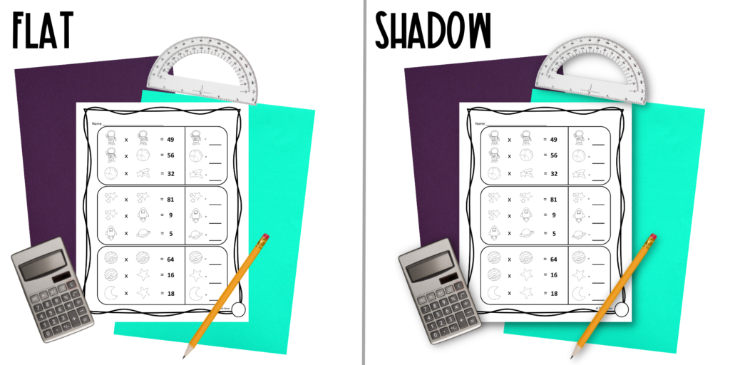
When you create a mockup, you want to provide the viewer’s brain with a straightforward picture that closely matches reality. Consider the differences in these two images:

In the image on the right, I applied what is known as a drop shadow. All of the shadows drop from the bottom, to the right – as if the light source were from the top left. Our brain sees images like this in reality – even if we are consciously “seeing” it. There are very few circumstances where our brains would see an image, particularly in an education or work environment setting, with ZERO shadow. So, the image on the left looks completely fabricated and “unreal” to our brains. While a buyer may not realize that is why they skip to the next cover, pin, or continue scrolling… they might!
Applying Shadows to Mockups
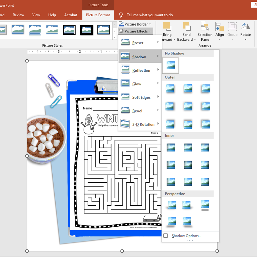
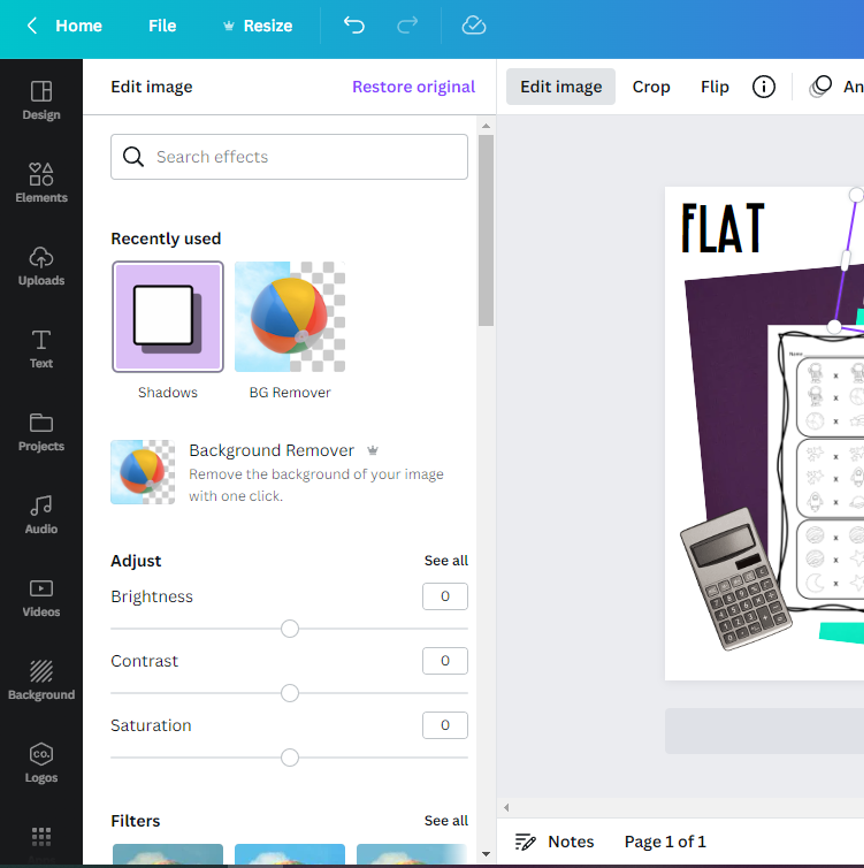
Most modern programs that include working with picture elements have the capability of easily adding shadow to images. To use shadows successfully, the image should be transparent – particularly around the edges where a shadow would naturally be. Adding shadow to an image is a fairly novice skill. Here are two popular editing programs and how to access the shadow feature:

In PowerPoint, or other Microsoft applications, under the Picture Format tab, select “picture effects > shadow > choose desired effect.

In Canva, you can find the Shadow effect by clicking “Edit Image.” Sometimes you will need to search effects for “shadow” to find this tool
Happy Creating!
Now you have the tools to add shadow to your mockups! There are many places to find mockups and mockup elements. (My shop is one of them!) If you have any questions about how I use mockups, reach out! Sign up for my newsletter for more tips, updates, and yes – FREEBIES!

