Swipe Right on Product Covers
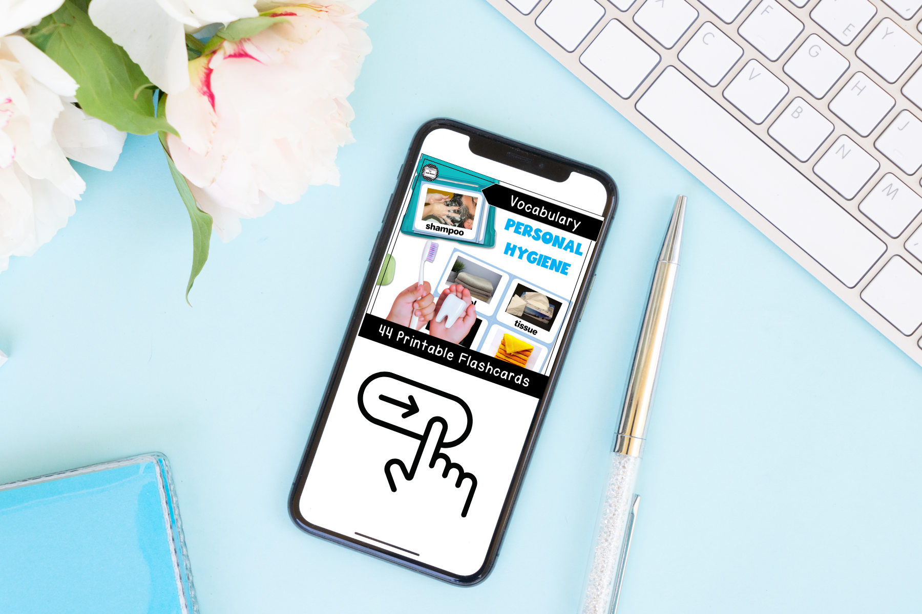
She sits down nervously and closes her eyes – phone in hand. The background noise of many people talking is there somewhere, but she is lost in her thoughts. She has been searching for awhile and still hasn’t quite found what she is looking for. She takes a deep breath. In her mind, she knows exactly what she is looking for -she just hasn’t found it yet! As she opens her eyes and looks at her screen, something catches her eye. Her heart quickens with the “oh, this could be good” anticipation she knows she has felt so many times before. Her finger reaches for the image in front of her – she wants to know more! YES! On the screen is a swipe right cover featuring a mockup of the activity she had envisioned her students participating in that week. She is so happy to know that Friday’s math centers are going to be a match made just for her thirds graders.
Product Covers and Online Dating
Creating covers and online dating may seem like they have absolutely nothing in common, but they both involve making a quick first impression that can make or break the outcome. Just like you want to present yourself in the best possible light online to find a possible date, you want to design covers that catch the eye and make the potential buyer interested in learning more. Showcasing your best qualities while using a dating app is like highlighting the best features of your product or resource on the cover. In both circumstances, your brain is making a very fast choice. Is the subject before you is worth the time and energy to learn more. The “Swipe Right/Swipe Left” decision for your product is made in seconds!
While I am too old to know the in’s and out’s of online dating, I am comfortable with product covers. The following are some things to consider to help create Swipe Right Covers:
First Impressions
Product covers are the first thing your potential buyer sees when browsing online marketplaces. The entire job of a product cover is to create a first impression that makes someone want to know more. A positive impression is more likely to result in a positive interaction. And, like the world of dating, it is possible for an amazing product (or person) to be behind a not quite so amazing cover (or picture.)
I believe in a genuine approach to your first impressions. If your covers are a complete opposite to the feel of your product, the positive feelings may fade and the viewer will move on. By viewing your cover, your audience should have a pretty clear understanding about what to expect when they read your description or view your previews.
Visual Appeal
The competition for digital products continues to grow daily. At TPT Forward 2022, a well-seasoned seller stated (in summary) that at the beginning of her journey, the look of a cover didn’t hold much weight on it’s success. But, as the number of similar sellers and resources increased, it became critical to revise covers. Showcasing their products immediately instead of relying on descriptions and previews became a priority. Swipe right covers became more important than ever. (See this article for interesting insights on our brains and images!)
I found this to be the case in my experience, as well. The product (with it’s “Did-they-really-look-like-that!?” *hides face* looking cover) on the left sold very well “as-is” in 2019. It was a rather unique product at the time, so the look of the cover wasn’t a deal breaker. (Thank goodness!) However, I have had to “improve my profile” with the increased similar products to keep views and sales up.

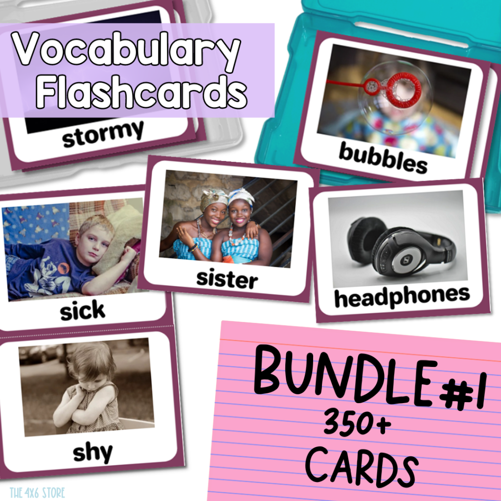
I think it’s very obvious which cover is the “Swipe Right Cover” in this example.
Professionalism
Having a high quality product cover can also convey professionalism and quality to the buyer. A cover that is well-designed can help immediately establish trust with the intended audience. It can also send the message, “This resources is worth the investment.” (Just like a potential match is more likely to be made if you feel like you can trust them after viewing their profile.) Those who take time to create well-designed covers are often the same creators who create well-designed products.
Branding
Your product covers can establish your brand on online marketplaces and help your buyers recognize your resources. Following along with the dating app metaphor, your first impression reviewing a profile may leave your more memorable. “Branding” is just a fancy word for “making it you.” Being genuine is the best way to build your branding.
In almost every aspect of our lives, humans like to have comfort, happiness, and overall peace in our lives. Consistency and positive experiences are a great way to find this. We tend to associate a picture, like a logo, with those feelings. For example, anyone who sees the Golden Arches has an automatic association with food.) Likewise, there are some sellers on TPT that I can easily identify just by their covers! They have built up consistent, reliable branding that is uniquely them!
**I am going to leave a note here that this takes a LOT of time and it changes – and that’s ok! This is one area that I am trying to refine and define even after 5+ years. But checkout my storefront to see how it’s coming together!

Last Thoughts…
Being a Teacher Seller is a learning journey! (And I’d venture to say easier than online dating!!!) Don’t stress out about making things “picture perfect” or doing everything 100% “right.” You will discover that your creating story is just like life: You live and learn. Time and experience help you make the improvements you need to “be your best store.” Each seller is going to have different design styles and preferences. Be YOU and “your people” will find you and click on your swipe right covers.
Happy Creating!
-Stephanie M.
