Teacher Seller Guide to Selecting Fonts
Selecting fonts for products, covers, and other uses has been an interesting journey for me. I have gone through several different fonts in my creative career, but have decided – at least for my brand – that simple is ok! Here are a few things to consider when selecting a font for your teacher-seller products and covers.
Font Matters
Whether we realize it or not, font often conveys a certain tone, captures the writers personality, or sends the reader a message. Selecting the correct fonts for your products can help attract the right audience and produce quality looking resources.
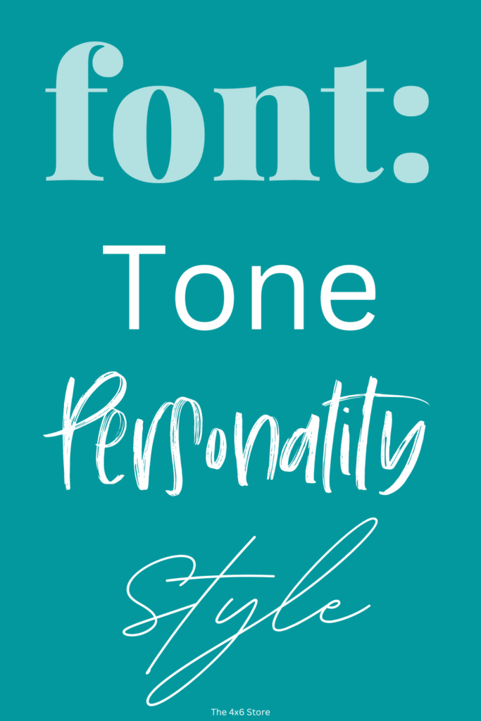
In education, there are many different academic levels and targets. A seller of elementary products may want to convey a more playful tone with a lighthearted feel on their covers or products, while a secondary teacher may want a confident, professional tone. With thousands of fonts to choose from, selecting the right one can be overwhelming. I hope the following helps make things a little less “whelming” for you as a content creator!
Types of Eye Catching Fonts
The goal, first and foremost, is to choose fonts that look good! A product may be amazing… but written with the wrong font… it will set on the digital shelf, collecting digital dust. Knowing the types of fonts and their purpose is a helpful tool for font selection.
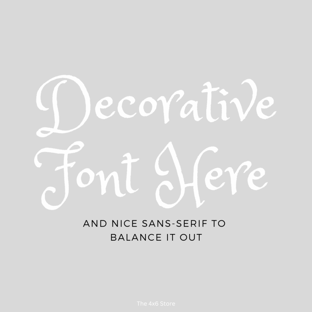
Display and Decorative fonts are designed to be used in headlines, titles and other “Look-at-Me” elements. These fonts typically have a unique look to them, often ornate, that can add to the personality of your cover or title. These are often seen and associated more closely with elementary fonts. (Examples: Brush Script, Pacifico, Parisienne)

Script Fonts are created to look like handwriting and/or calligraphy. This is a more popular choice for formal or elegant designs. They can be eye-catching due to how natural they look, however selecting one that is sized correctly and easy to read is important! (Example: Georgia and Times New Roman)

Bold Sans-Serif fonts are bold and attention grabbing. They often are an effective choice for advertising when one wants to convey a strong and confident message. (Example: Impact and Montserrat)

Easy to Read Fonts
Resources in education are typically made with clear, easy-to-read sans-serif fonts. The following are some popular ones:
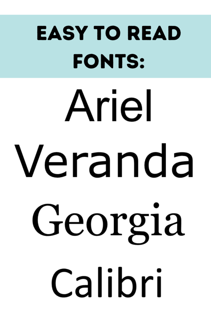
Ariel: This is a sans-serif font known for clean lines and straightforward letterforms. It is popular for print and digital materials because it is very legible to most readers.
Veranda: This sans-serif font was created specifically for computer screens. The letters are formed a little wider and the spacing of the font is increased for a better on-screen reading experience.
Georgia: While this font features serifs, it has been noted that it is easier to read than other serif fonts due to increased spacing and wide letterforms.
Calibri: Calibri, also a sans-serif font, features more rounded letter shapes, making it a softer looking font.
*Dyslexie: This is a font created specifically for individuals with dyslexia. It has an interesting creation story, centering around creating a font with unique design elements helpful for dyslexic individuals. (Note: consider other factors such as size, spacing, color, and context when choosing fonts for individuals with dyslexia.)

Font Size
Font size should be large enough and clear enough for readers to see on the media in which it is presented. Small or overly frilly fonts are often skipped over when they are unclear.
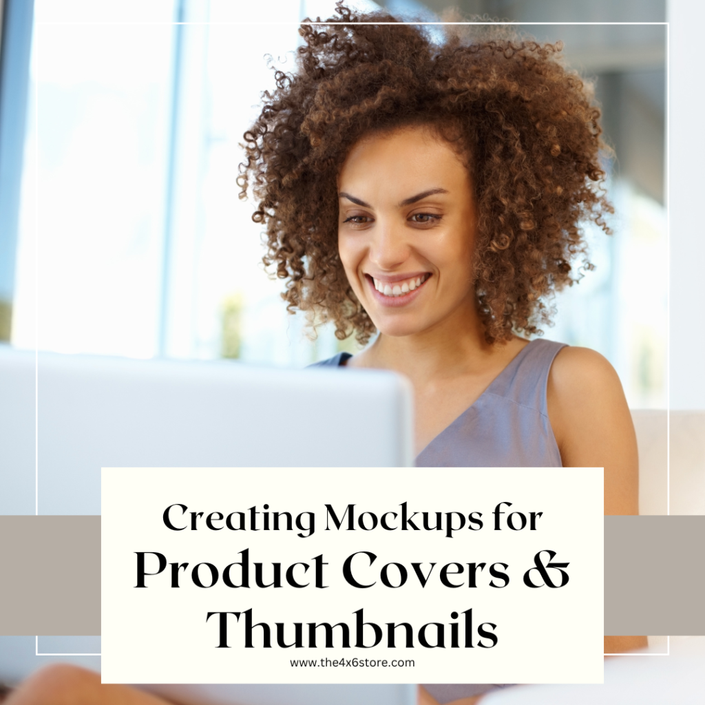
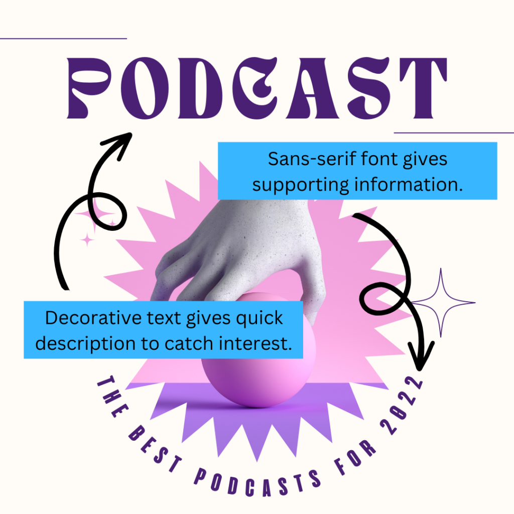
Product Covers and Social Media: Teacher sellers should consider that product titles and information are often viewed on mobile devices. Small sized text or having a large amount of text will not be clear on these previews. Text should be concise and enough to “Draw You In” to view the thumbnails, descriptions, and previews. (I often find readable text size for covers begins around 48 point for most standard fonts.)
The same thing applies to social media, however, more text is “allowable” on social media posts – usually as secondary graphics to “the eye catcher.” Scroll through Canva and you will find many, many examples of the use of varied font size for “The Draw In” vs “The Details.” See this example I pulled from a premade social media template:
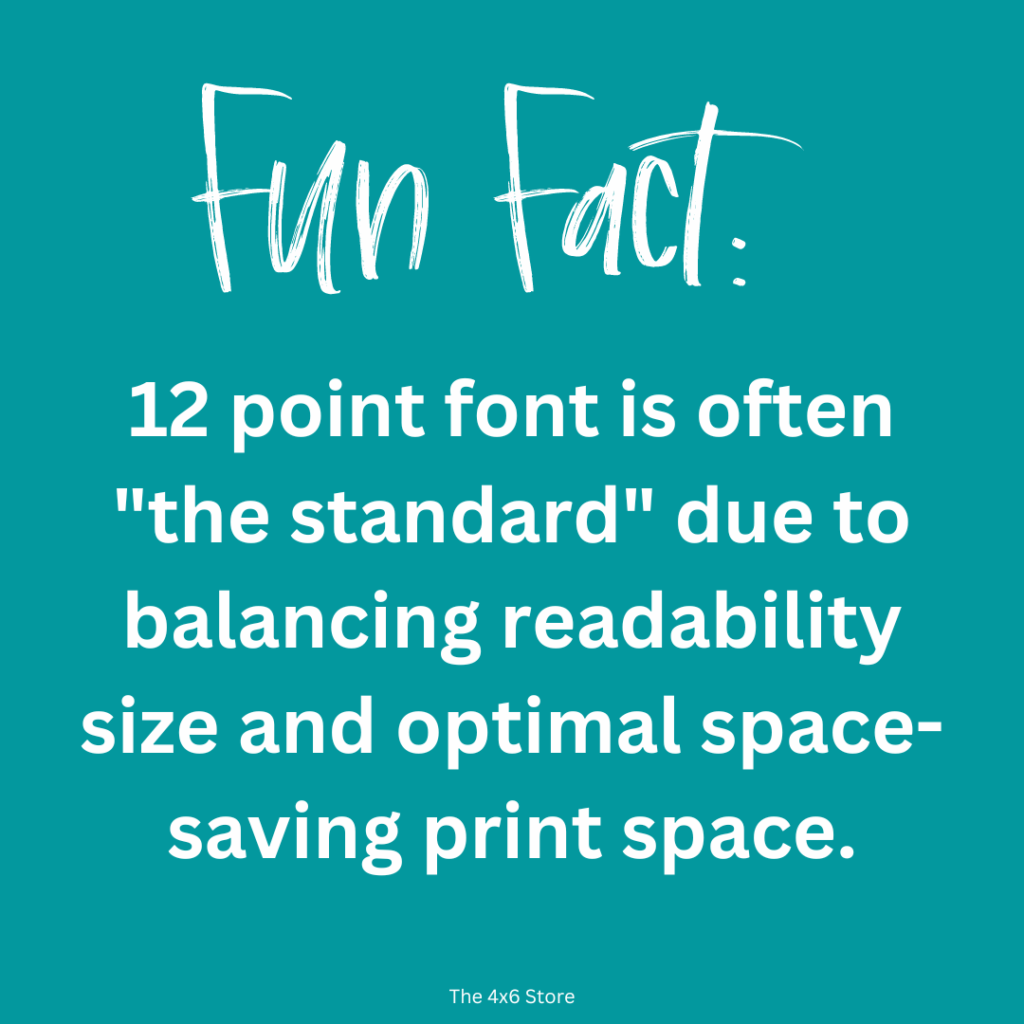
Product Creation: As mentioned before, the audience should be kept in mind for the resources you are creating. Early elementary students may not be able to read frilly, wavy, or script fonts or text that is too small. These products and worksheets should focus on fonts easily read by young readers. Likewise, secondary student may not appreciate childish fonts. The use of titles, headings, and clipart often vary between age levels, as well. When selecting fonts, use a text size that is close to the standard 12 point font, especially for text heavy resources. (As a guide, I typically keep to more standard fonts for my resources. I can have “fun with fonts” in my classroom decorations and other business related endeavors! But that’s a personal choice!)
Mixing it Up
Understanding how to mix fonts that compliment each other can seem easy “on paper,” but often takes lots of trial and error. (This is a skill I will admit to still working on. I usually just trust Canva to pick a good combo for me!) As a rule of thumb, selecting fonts that have contrast often make for a good match. An example would be to match a bold sans-serif font with a more delicate serif font. Trial and error is often required to find a favorite. Or let’s be real – Google is your friend.
Last Thoughts…
I hope this has been has been helpful for selecting fonts for your products and mockup covers. It has taken me awhile to figure out – and I am still learning! It’s a process! Also, just because I didn’t mention a font in this article doesn’t mean it won’t work! These are just guidelines There are MANY amazing creators out there who create fonts to make your products and covers shine. My favorite fonts are from KA Fonts and CK Fonts. < Not an endorsement! Just sharing the awesome!
Happy Creating!
