Creating Mockups for Covers and Thumbnails for Educational Products
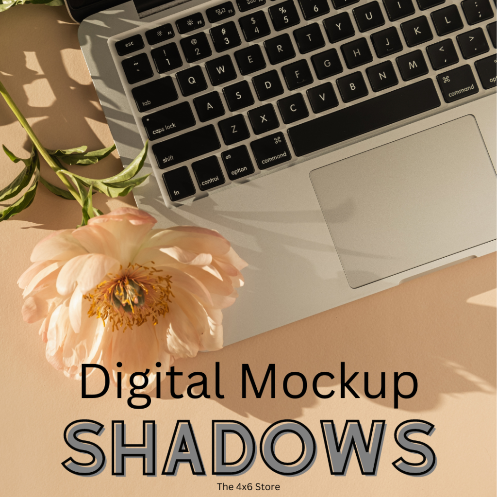
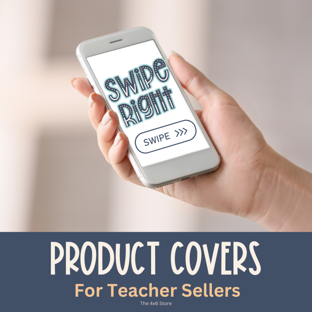
If you are a teacherpreneur like me, you are probably looking for ways to streamline the nitty-gritty, no fun details of your business – like product covers and thumbnail creation. Mockups and digital photography are two great ways to design, update, and refresh eye-catching covers and thumbnails (that also double for social media use!). Creating mockups for covers and thumbnails can be a BIG time (and sanity) saver!
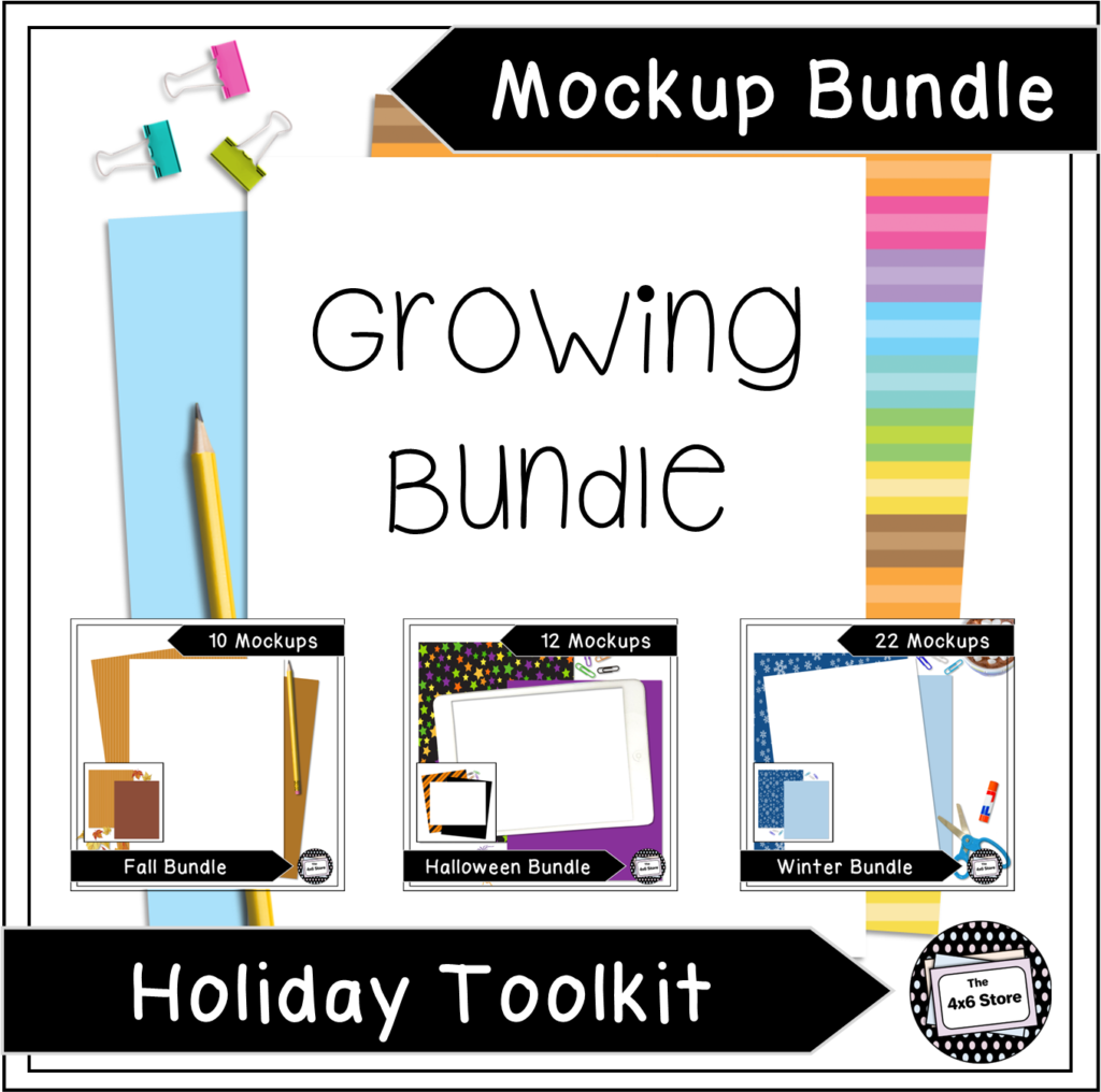
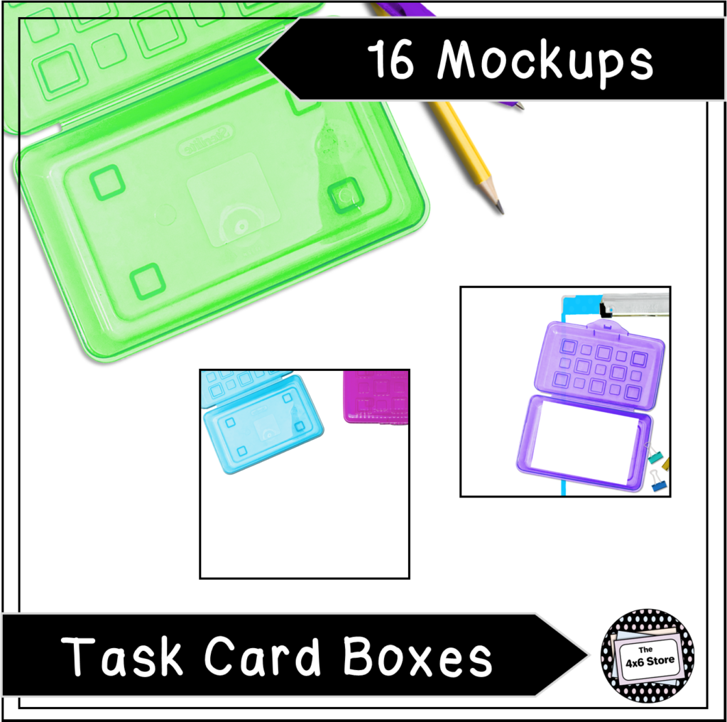
One of the small changes I made to my store was the use of digital mockups for my product covers. The process of having to print all of my products, set a mockup stage, add detail items, select the correct lighting, use valuable space in my home, and so on for real product photography was a little overwhelming for me! (If you like that kind of thing – go for it!) Through some trial and error, I found digital mockups to be the best solution for my needs. I love creating templates to quickly make the covers I need!
I began with a few freebie digital mockups, but the ones I tried seemed too visually busy and cluttered for my simple style. The mockups I have created have a very simple background and relevant details – as to put the focus on my products. They also allow for more personalization and variation using programs like Canva and other mockup elements. Because I use my mockups for my own store as well, I have added elements (like banners and shapes) to make my covers unique from others also using my mockups!
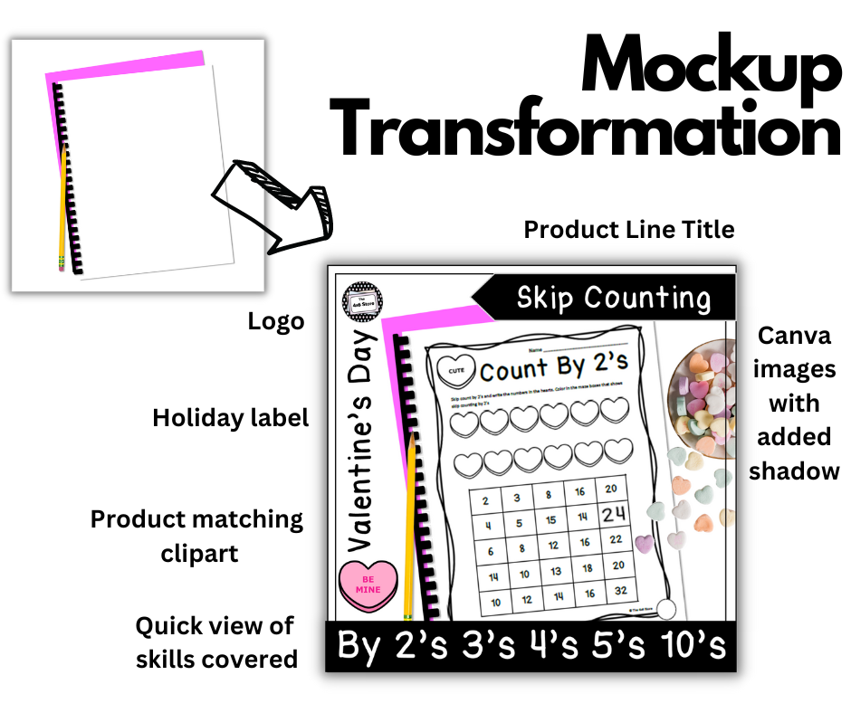
Creating your own mockups can be overwhelming. Whether you are using a template or starting from scratch, choosing to do digital mockups or real product photography, there are a few important things to consider for effective product display. I have put together what I have learned about creating product covers into a few simple tips.
Tips For Creating Effective Mockup Covers:

1. Choose a Consistent Cover Size
Different marketplaces have different aspect ratios, but square covers seem to be the most popular. (TPT authors typically use square covers and thumbnails.) When creating square covers in a program such as Canva or PowerPoint, many creators use a 12×12 or 10×10 canvas.
2. Insert Clear, Easy to Read Titles
Consider how you browse for items while shopping online. Titles that are large enough to read on personal devices, such as phones and tablets, are important to keep in mind. As you are creating mockups for covers and thumbnails, use different sized screens to see how your text appears for readability. I will often upload a sample cover to one of my products and see how it looks on my desktop, iPad, and phone before proceeding with an entire product line. Also, choose fonts that are easy to read!
3. Display Relevant Text
I will admit it took me awhile to figure this one out. When I began making product covers, I wanted my potential buyers to know everything about my product just by looking at the cover. However, this led to my covers looking cluttered, with small, unimportant text, and not very eye catching on the whole. Are you ready to see one of my old covers… that now makes me cringe a little on the inside?
Live and learn, right?
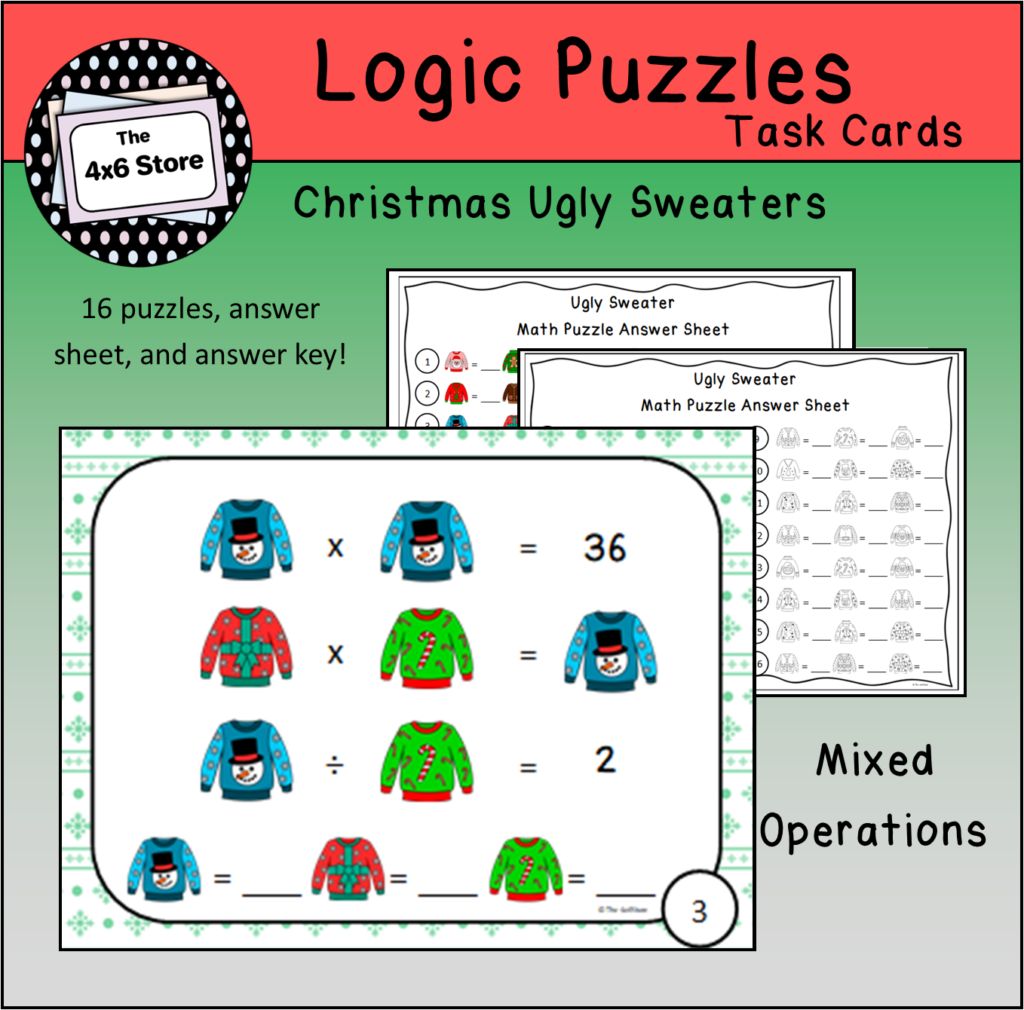
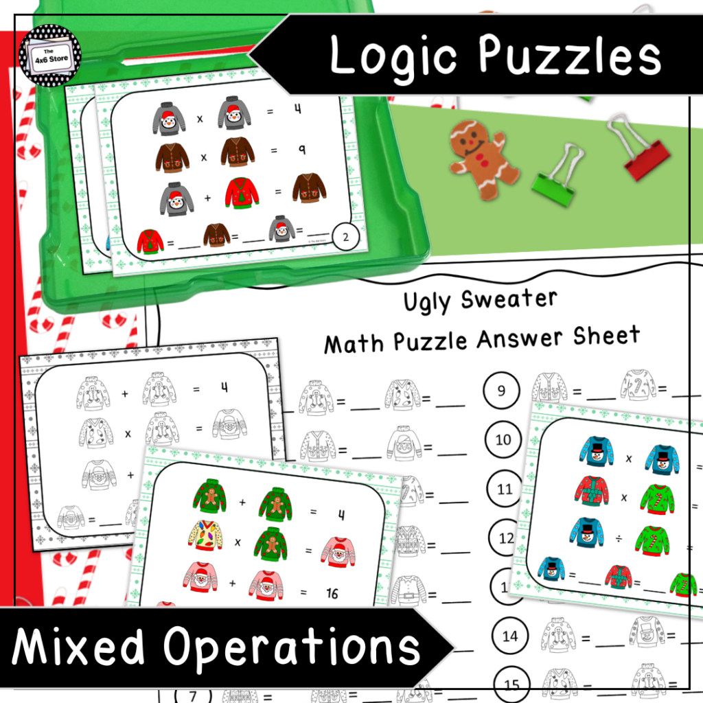
My newly designed covers have a simple subject tag on them – such as “Iconic Notation” or “Logic Puzzles” with a more “official” title like “Christmas Composition Activity.” All other text is saved for my other thumbnails or PDF preview. I rely mostly on product pictures to catch my buyer’s interest and show what is included with each product. I also use the simplicity of “see product preview” in a thumbnail to direct buyers to a more detailed explanation.
Can you see the difference? Which one are you more likely to click?
4. Focus on Product
The use of space on product covers and thumbnails is important. There is only a limited area for you to “stop the scroll.” Be aware of dead space, distracting details, and where your buyer’s eye will be naturally drawn to. A full page preview of a product may or may not be necessary. Often, a sneak peak of a larger view of your product piques interest better than a tiny preview of a full page! (You can see this in the above covers, as well!) Only add element images of things that make sense to go with your resource. (Snag these FREE papers and pencils!!)
5. Brand Recognition
Adding a store logo or having uniquely designed covers can help with building brand recognition. There are a few TPT authors that I have learned to identify their products solely on the way they have designed their product covers! (#StoreGoals) This is an area I am working on developing myself!

Reach Out!
If you like the idea of digital mockups but still haven’t found the template you are looking for, send me an email (the4x6store@gmail.com)! I have created custom mockups for other TPT Authors in the past that align to their brand colors and product needs! Or check out these – including a freebie – to begin creating mockups for covers and thumbnails today! You can also find me on FB and IG!

